Book Circle
Community feature enhancement
Introduction: The Opening Chapter
For this project, I was tasked with adding a new feature to an existing application. As someone who reads regularly and relies on Goodreads daily to track my progress, it felt natural to choose this app as my focus.
The Antagonist: A disconneted community
While Goodreads has a lot of great features, it falls short when it comes to direct communication, which is a big part of people’s reading journeys. From my research, I found that users often turn to other messaging apps to discuss books with friends, creating unnecessary friction. The lack of a strong direct communication feature hinders the sense of community that could make the reading experience more engaging.
The Protagonist: An added feature
An added feature where users can:
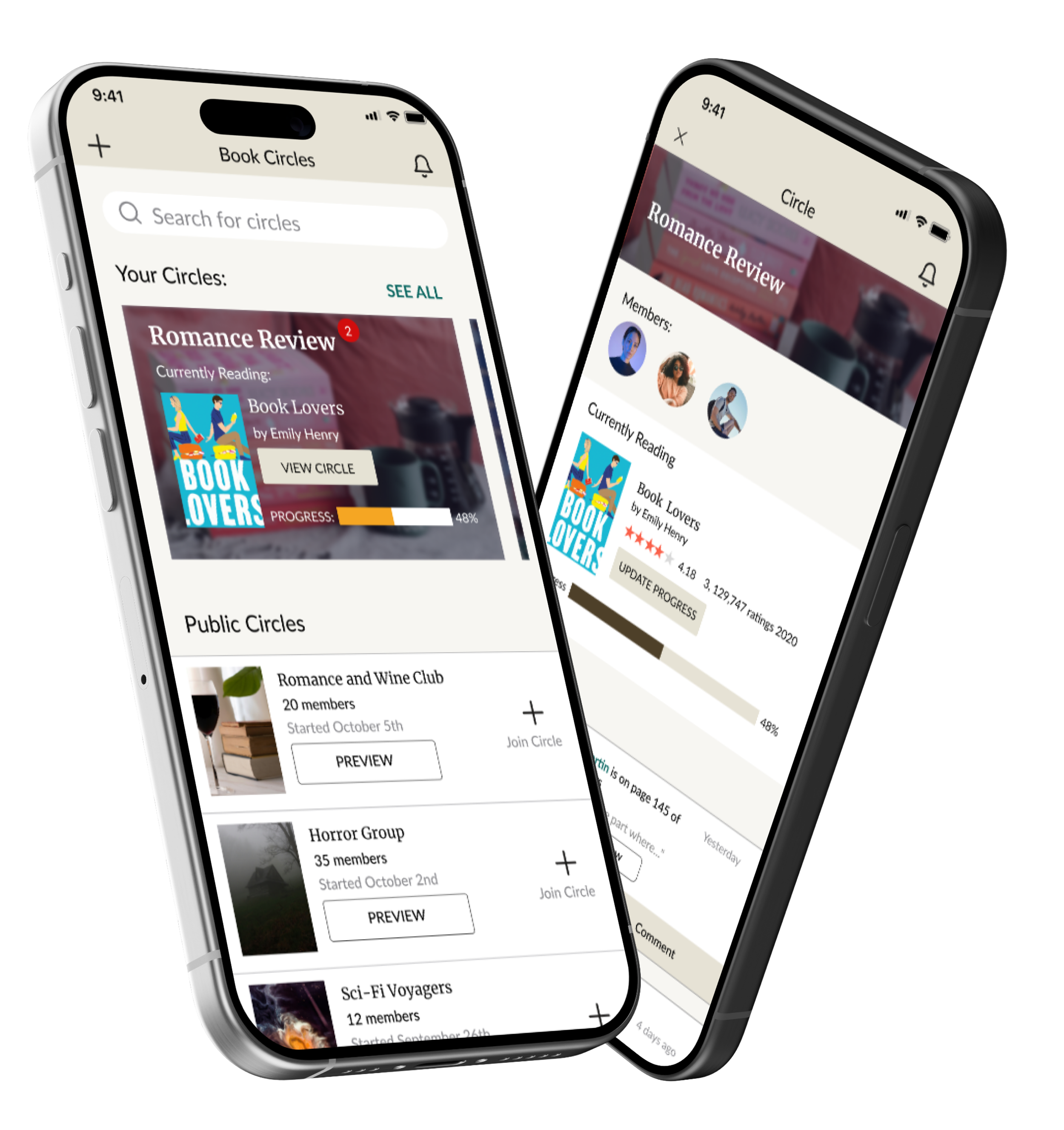
Join and create book circle for more direct communication
Collaborate with friends on their reading journeys
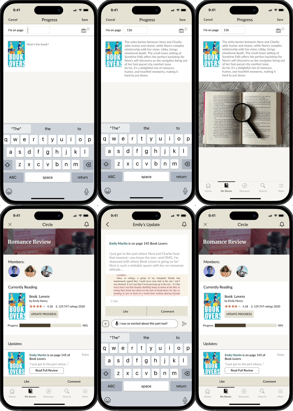
Share updates directly to users in the circle
Upload photographs of book passages to add specifics to the update.
Interact with friends updates
How it works: key features
Create a book circle
Create a group by selecting a book, adding friends, and choosing a circle name.
This feature allows you to customize the group based on the book you want to read and the friends you want to interact with.
Update group and view updates
In the book circle you can share updates, stay connected with your circle, and engage with your friends' posts and activities.
This allows for more direct and in-depth group analysis of the book without worrying if others can see your comments.
Join friends’ groups
Get notifications and join your friends’ or commmunities book circles to interact with their reading journeys.
Writing the Story
Exposition: Reading between the lines
Research goal
Through my research, I wanted to find out what users felt was missing in the app, particularly around the community aspect, to identify a specific area where I could develop a solution.
Why users feel that the community aspect of reading excels their reading journey.
What are the primary goals that the user hopes to achieve through the app.
How users go about communicating with others through the app.
Competitive analysis
Prior to conducting my user interviews, I conducted a competitive analysis where I looked at similar apps and their reviews to see what users liked about these solutions and how they differed from Goodreads. The three apps I analyzed included:
The Storygraph
Fable
TBR Bookshelf
People have chosen Fabel over Goodreads because of the virtual book clubs and strong community aspect.
People like feeling connected to others and bonding about their book interests heightens their desire to read.
TBR Bookshelf was more focused on personalization which also motivates people to read.
Users really liked the more granular rating system of all three of these apps more than Goodreads whole star ratings.
Findings
Actionable summaries
Based on these insights, it’s clear that people are motivated to read when they have engaging ways to connect. Whether it’s personalizing a bookshelf, sharing reviews and ratings, or interacting with other, reading is about more than just the act of reading itself.
Action I can take: Focus on building a stronger sense of community that motivates and inspires people to keep reading.
User Interviews
I conducted 5 user interviews with users who regularly use Goodreads to get some more insights about how their goals and motivations for reading and using Goodreads.
Problem: After my user interviews, I realized my questions were too broad and lacked enough open-ended prompts to elicit stories, where key insights often emerge. While the research was still valuable, I learned the importance of tailoring questions more effectively.
Key Findings
Users value social connection and use the app to view other readers updates. 4/5 participants said they will typically see an update and then navigate to their messaging app to communicate with the other user about the book.
Some users said that they weren't or still aren't aware that you can comment under someone's update, indicating the feature is not as obvious,
3/5 users outwardly stated that they wished that there was a more direct/ intimate way to directly communicate with other users.
5/5 users have never tried any other platform except goodreads. This indicates to me that they are satisfied enough with their experience, but may not also be aware of what else is out there.
Meet Lauren: Our Persona
Once I had conducted all of my research and had my insights clear, I created a user persona to help ground my findings into a relatable user. I would look back on this persona throughout the process to help remember what the main goals of my user are.
To ensure that Lauren was a strong user persona, I used my findings from the affinity mapping to ground each of her motivations, needs, and goals.
Lauren is a 28 year old English teacher. She’s always had a passion for reading, and when she’s not teaching, she spends a lot of her free time delving into as many books as she can. She uses Goodreads and loves the community she’s built through the app. However, recently she’s been wanting a little bit more direct communication within the app.
Lauren wants to:
Be able to have literary discourse with her friends directly through the app to avoid losing her thoughts.
She prefers that her private messages on Goodreads remain unseen by everyone else.
She wants to follow her friends reading journey more intently so she can spark discussions with them in real-time.
She’s struggling to:
Have conversations with her friends because there’s no way to start a direct message thread with a person on the app.
Have strong connections with her friends reading journeys due to the lack of timely notifications.
Rising Action: Mapping the Narrative
Sitemaps
Once I had my features determined, I went in and constructed a sitemap to lay out the pages of the app. I included the pages that were already a part of Goodreads and just added mine on the side.
At this point of the design, I had yet to determine where the entry point for this new feature would be, so it is currently represented as another just another page on the navigation. However, I know for the future, that is not how I want the users to access it.
After creating the sitemap, I developed the user flow, designing tasks based on the feature set and what I wanted users to accomplish with this functionality.
Challenge: This was my first time creating a user flow, without creating a user wire flow first. I found that I had missed certain areas and had to go and add to it after creating my low-fidelity flows.
User Flows
Climax: Drafting the pages
Low-fidelity frames
User Testing
Once I completed my low-fidelity wireframes, I conducted usability tests in Figma to evaluate their functionality. Testing at this early stage allowed me to identify areas for improvement and ensure a solid foundation for the design process.
Approach: I carried out five user tests, both via Zoom and in person, observing participants as they navigated through each flow. I also made sure that my low-fidelity frames were detailed enough so that the user could identify the purpose of each screen.
Tasks that were tested included:
Creating a Book Circle
Joining a Book Circle
Creating updates for friends
Interacting with Friends Updates
Areas for improvement
Users weren’t sure what the purpose of the photo upload was.
There was no ability to decline a circle invite.
Users would like to be able to click on the book to see a review for it.
Polishing the manuscript
With the results from my low-fidelity testing in hand, I applied those insights to refine and develop my high-fidelity prototypes.
Creating a Book Circle
Joining a Book Circle
Interacting with an update
Creating an update
Resolution: Final High Fidelity
Happily Ever After
Success Metrics
Engagement rate
Retention rate
User satisfaction
Positive surveys
User growth
Epilogue
For my future roadmap, I have several features that I would like to build on based on research, testing, and outside feedback. These features include:
The ability for users to create start and end dates for their book circles.
Building out customization features for Book Circles so users can have fun background related to their books. This would act as an added incentive to read.
Conduct AB testing to see where the best entry point for this feature would be.
What I learned
This project significantly boosted my confidence in both Figma and UI design. Working within the established branding of Goodreads required me to closely follow their existing UI patterns, which expanded my understanding of how to maintain brand consistency in a design system.
Much of my time was dedicated to replicating these patterns while exploring Figma's tools, allowing me to enhance my technical skills and develop a stronger eye for detail in interface design.
This experience not only improved my proficiency but also reinforced the importance of aligning design decisions with a brand's identity.


